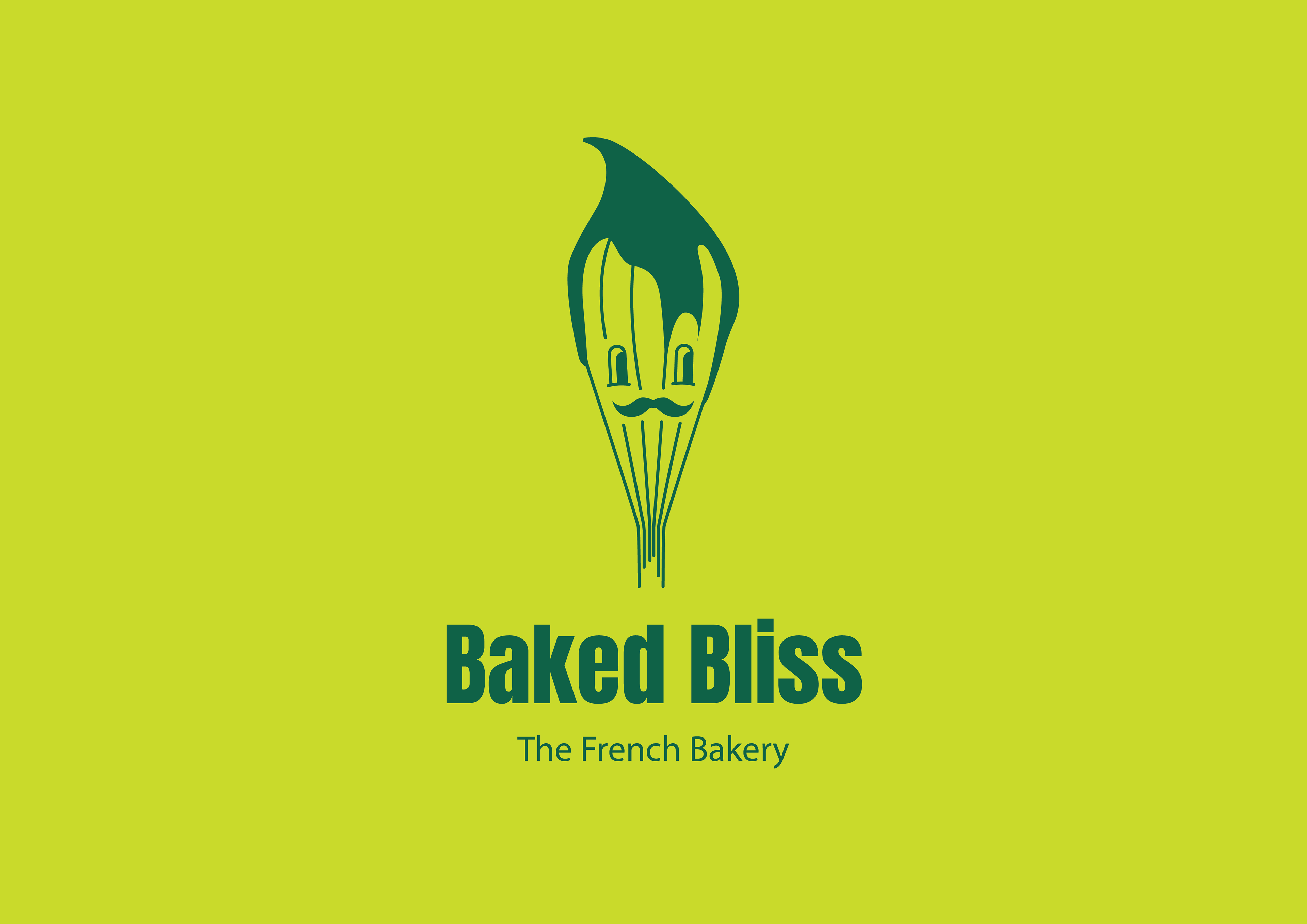
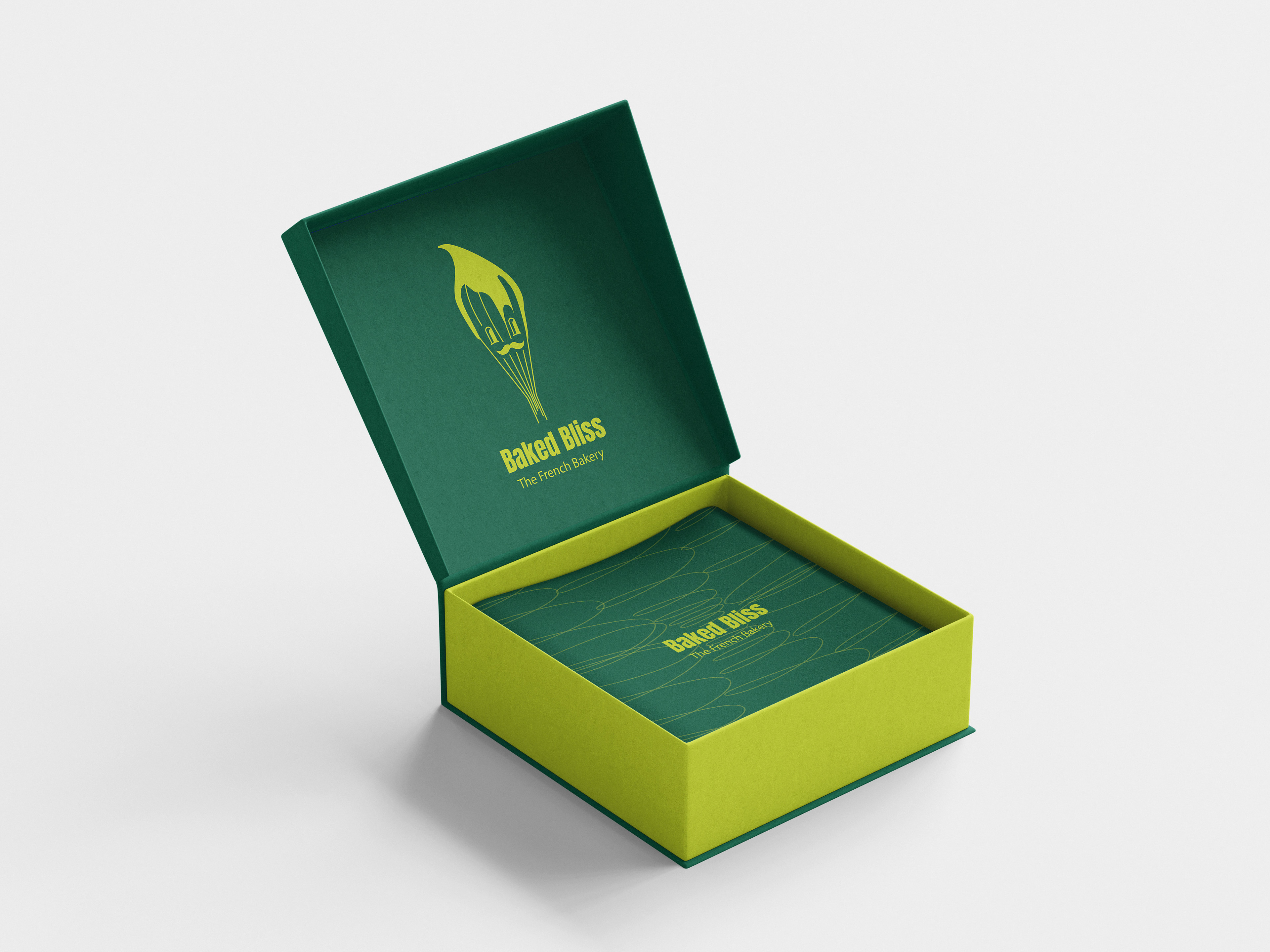
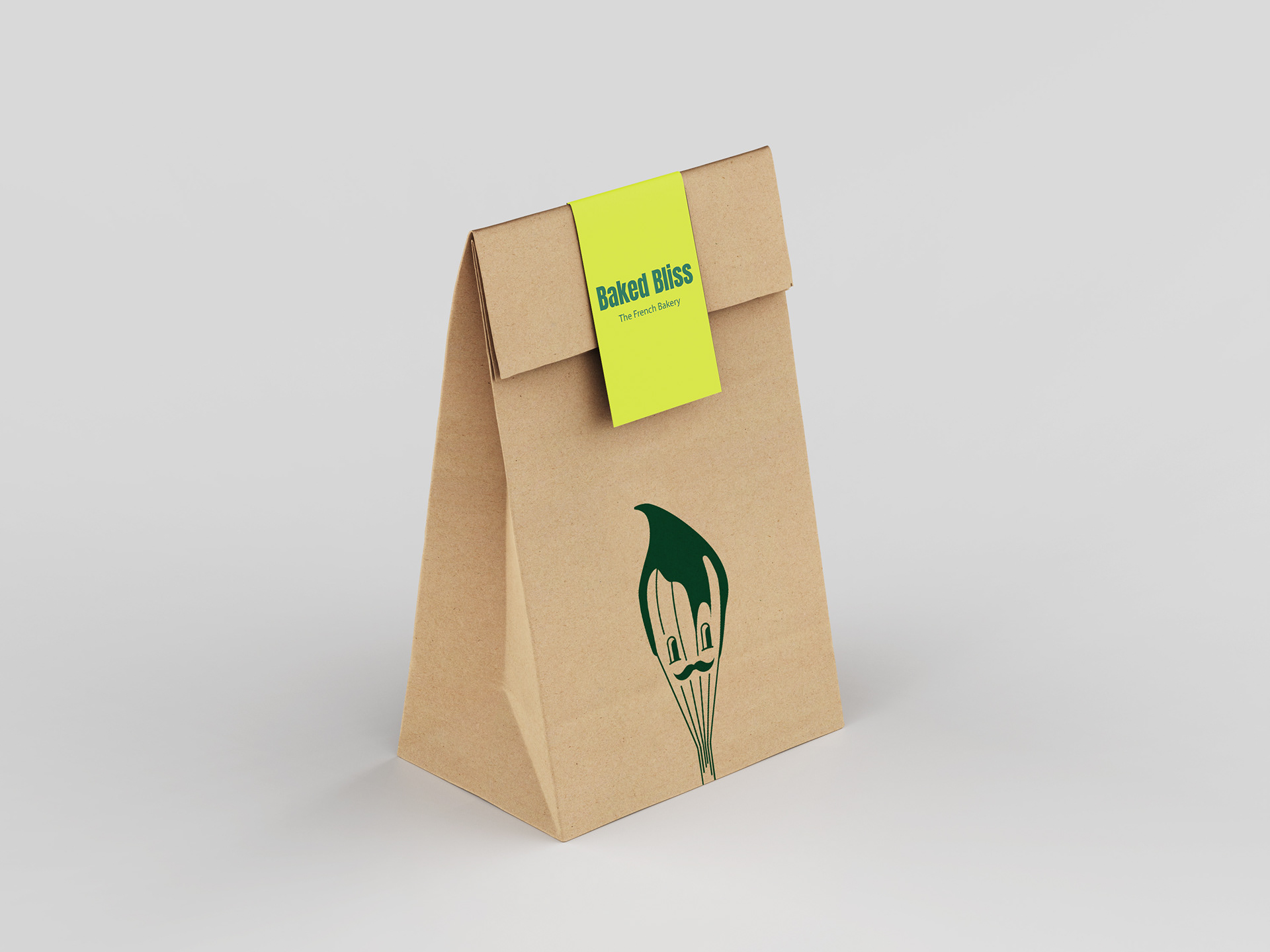
Baked Bliss is a personal project of mine where I wanted to explore creativity and push the boundaries of traditional bakery branding. Instead of the typical warm or pastel tones, I chose a bold, vibrant green—an unusual choice for a bakery environment. This unconventional color highlights how even a classic bakery can present itself in a fresh, modern, and memorable way.
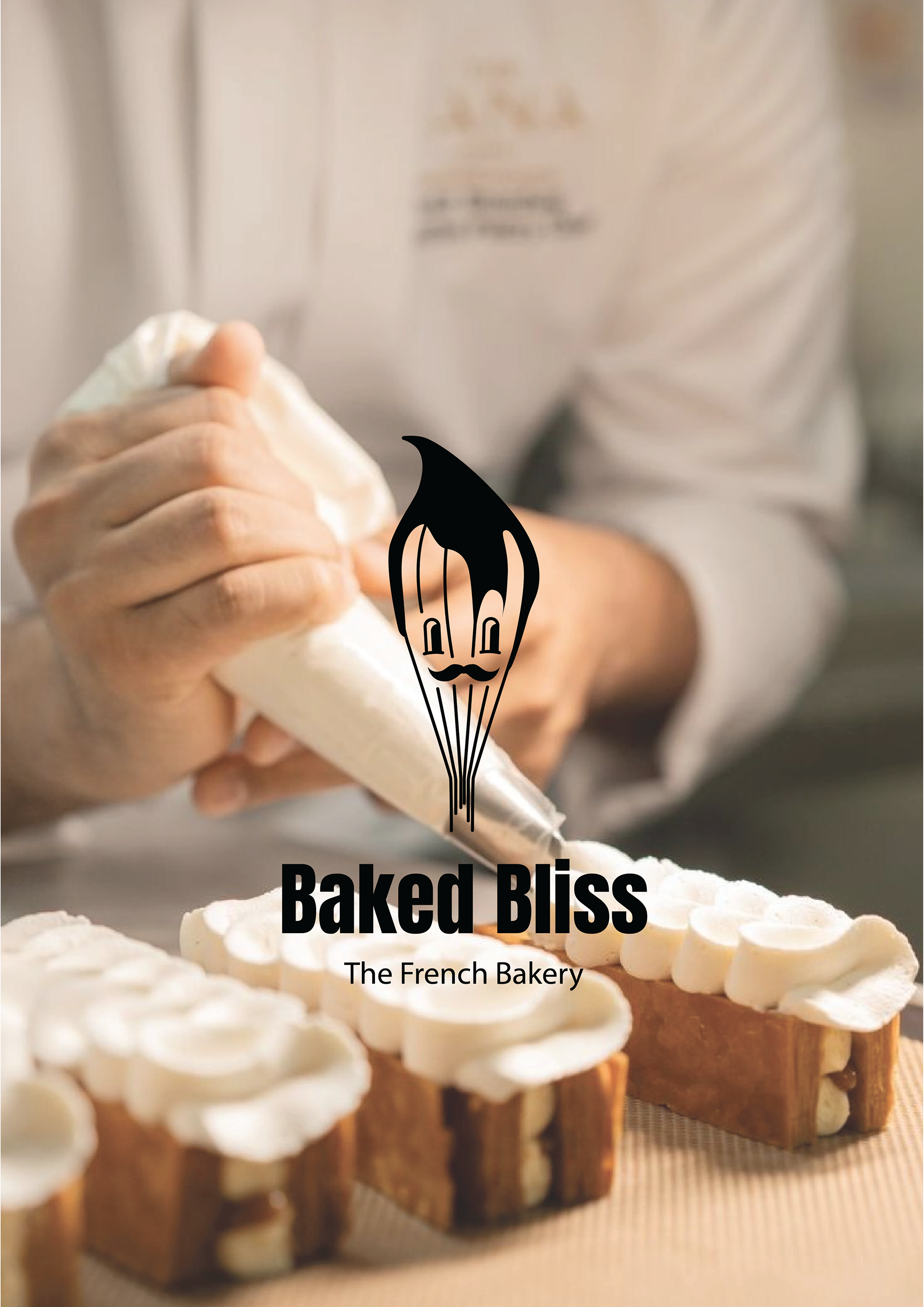
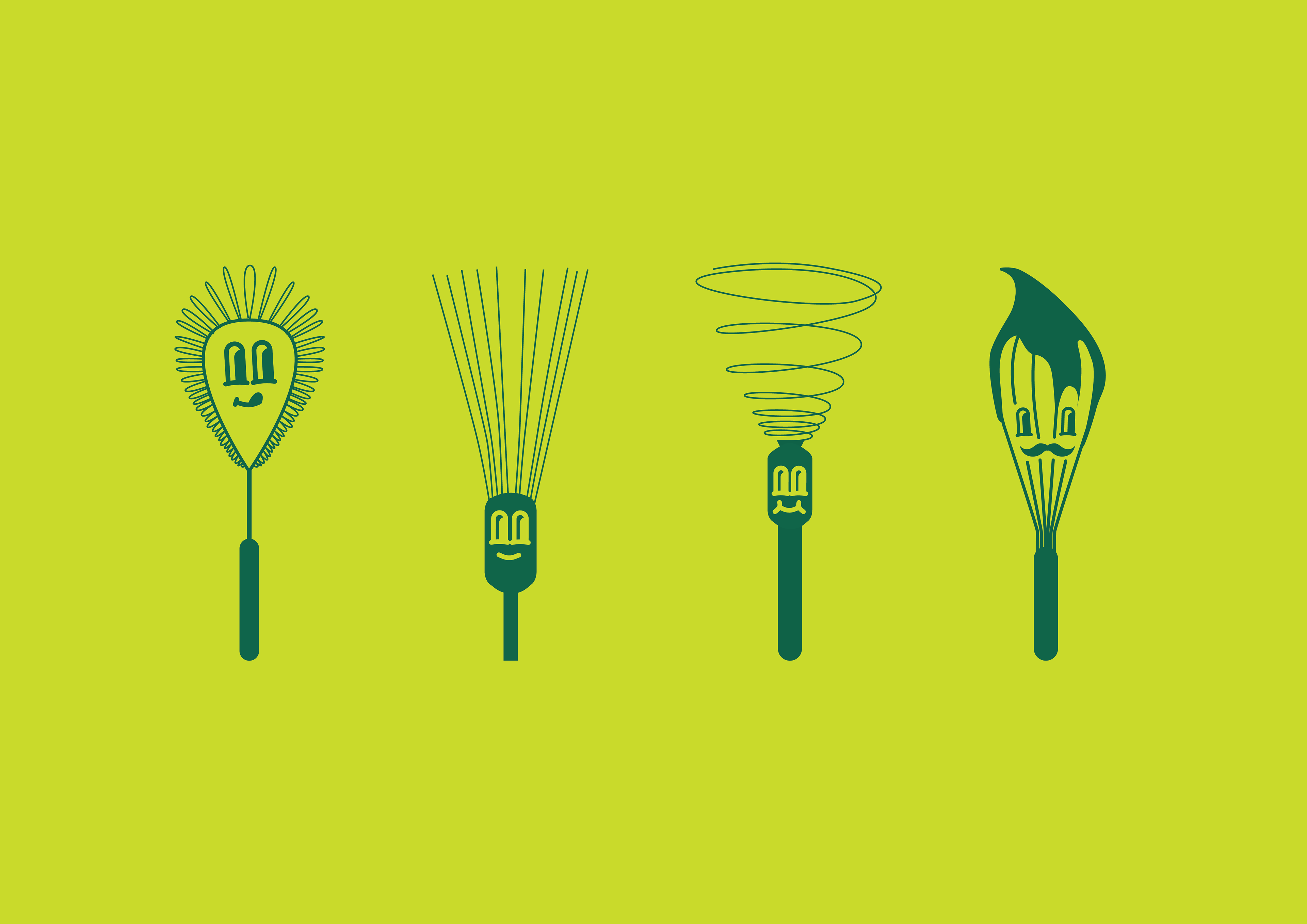
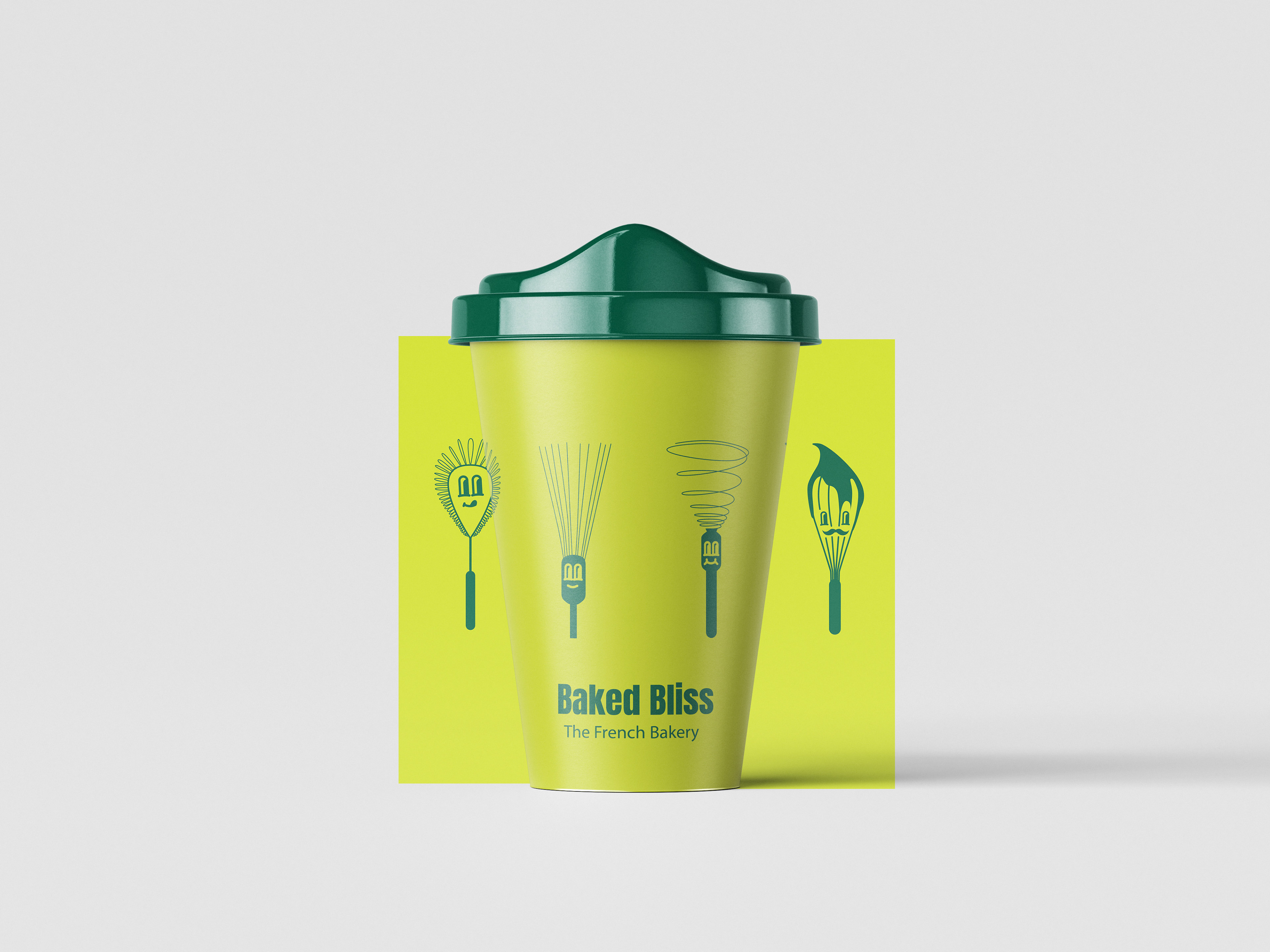
The core symbol of the identity is a whisk, representing the essence of baking. I developed it as a potential logo and expanded the concept into playful variations—creating fun illustrations that can be applied across different items, such as coffee mugs or packaging.
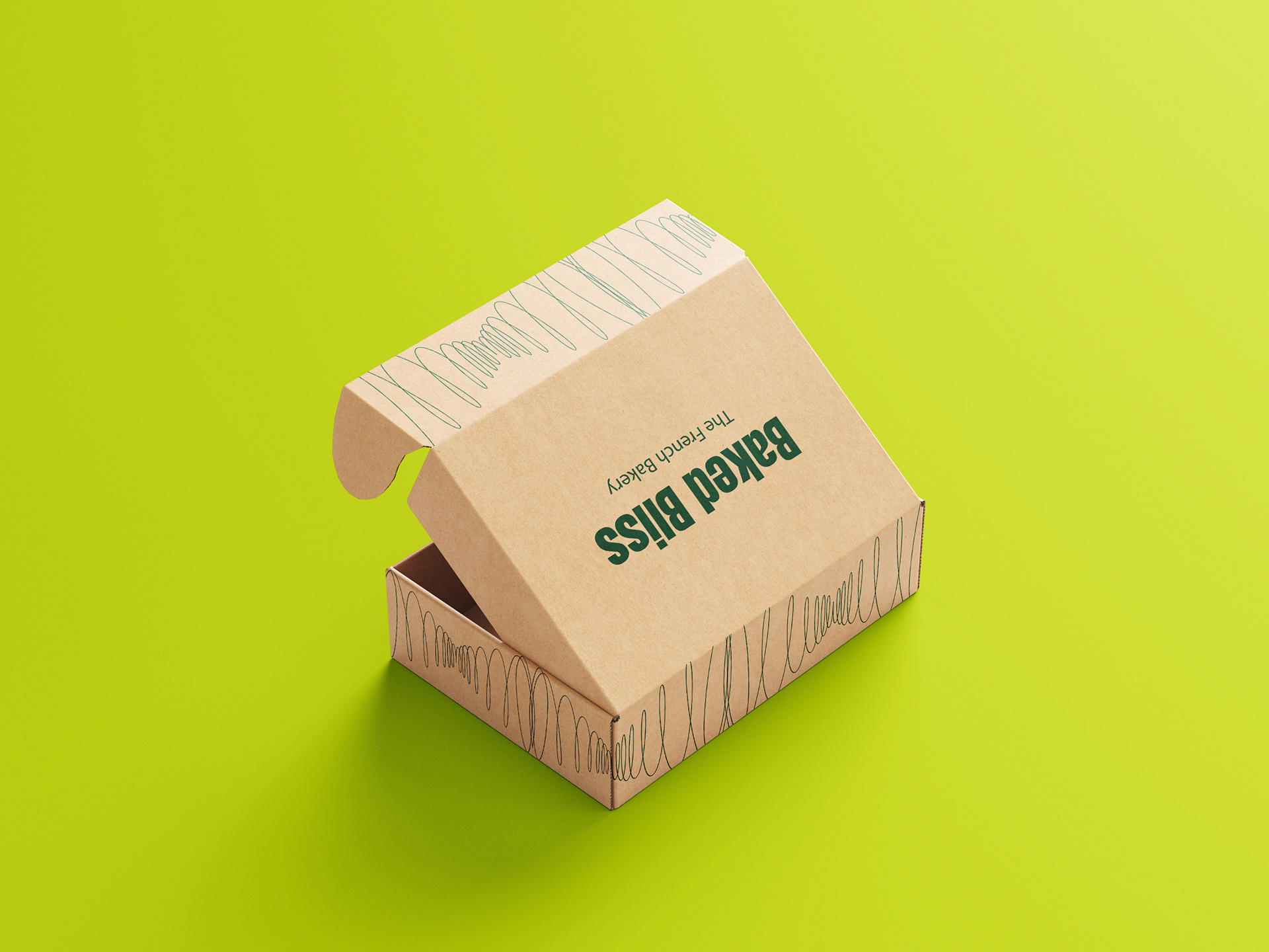
The movement of the whisk inspired me to create an organic, curving pattern, which adds energy and dynamism to the brand. This pattern can be used for boxes, prints, and other materials, tying the entire identity together.