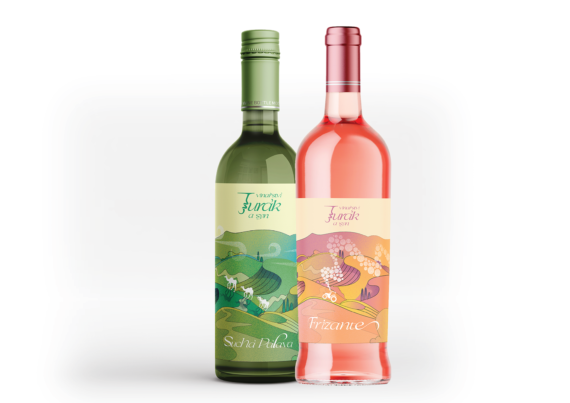


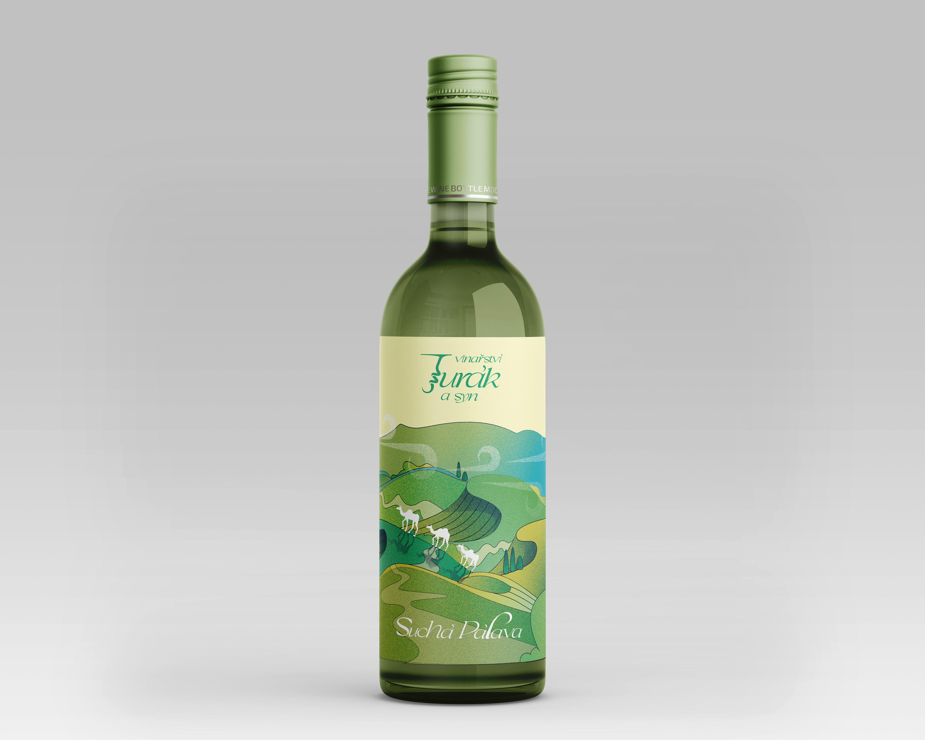
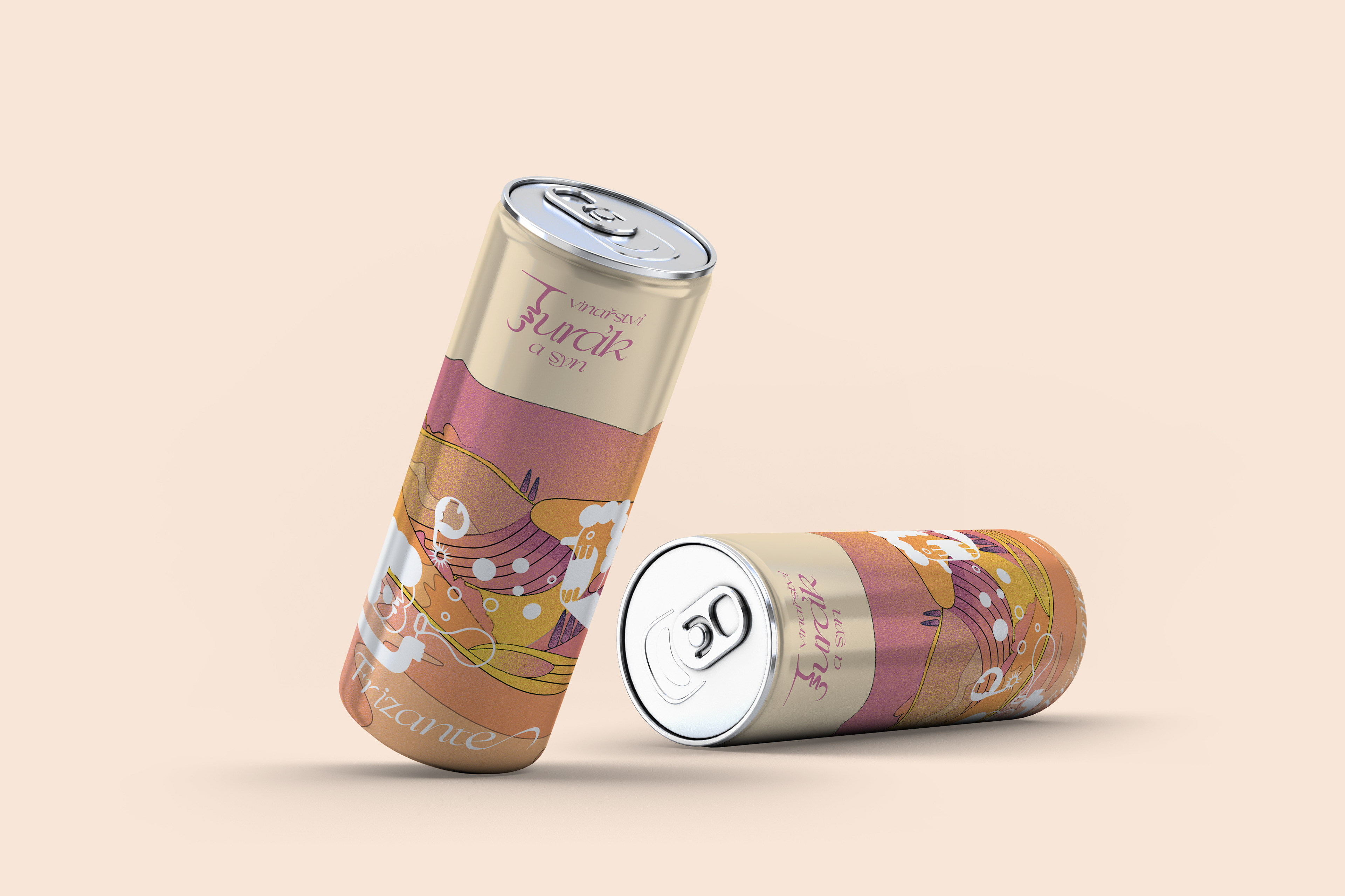

Jurak a syn winery located in South Moravia, approached me to design playful and colorful packaging for their wines – a frizzante and a dry Pálava. The owner liked my illustration style and wanted a similar fun, bold, and lively look that could also be adapted for cans.
I followed the brief closely: playful, witty, wild, and colorful. The illustration features the Pálava moutain in the background, with each variety given its own color palette that works together. The frizzante is designed in pink-orange tones, representing bubbles, which are humorously depicted as being blown from a tractor instead of smoke. On the cans, this idea is taken even further with a more playful version featuring a bubble blower.
The dry Pálava features camels, adding a funny touch that gives this wine line a unique personality.
As part of the project, I also created a new logo. Since it’s still a traditional winery, I chose an elegant script font that I designed myself...adding a special detail to the letter “J” in a shape of a corkscrew.